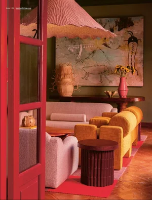

Colour Combinations We Can’t get enough of
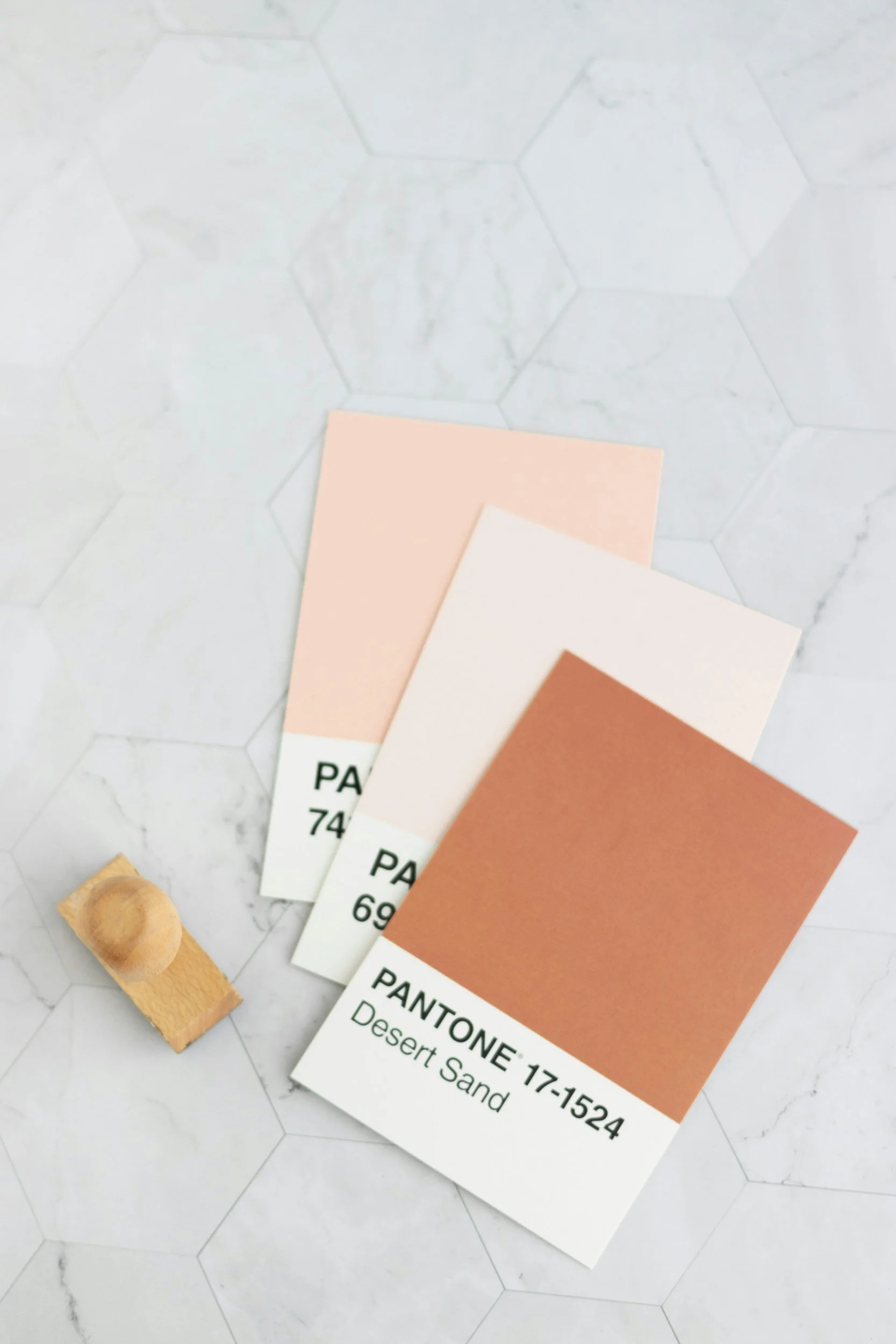
There are some colour pairings that immediately make a space feel elevated.
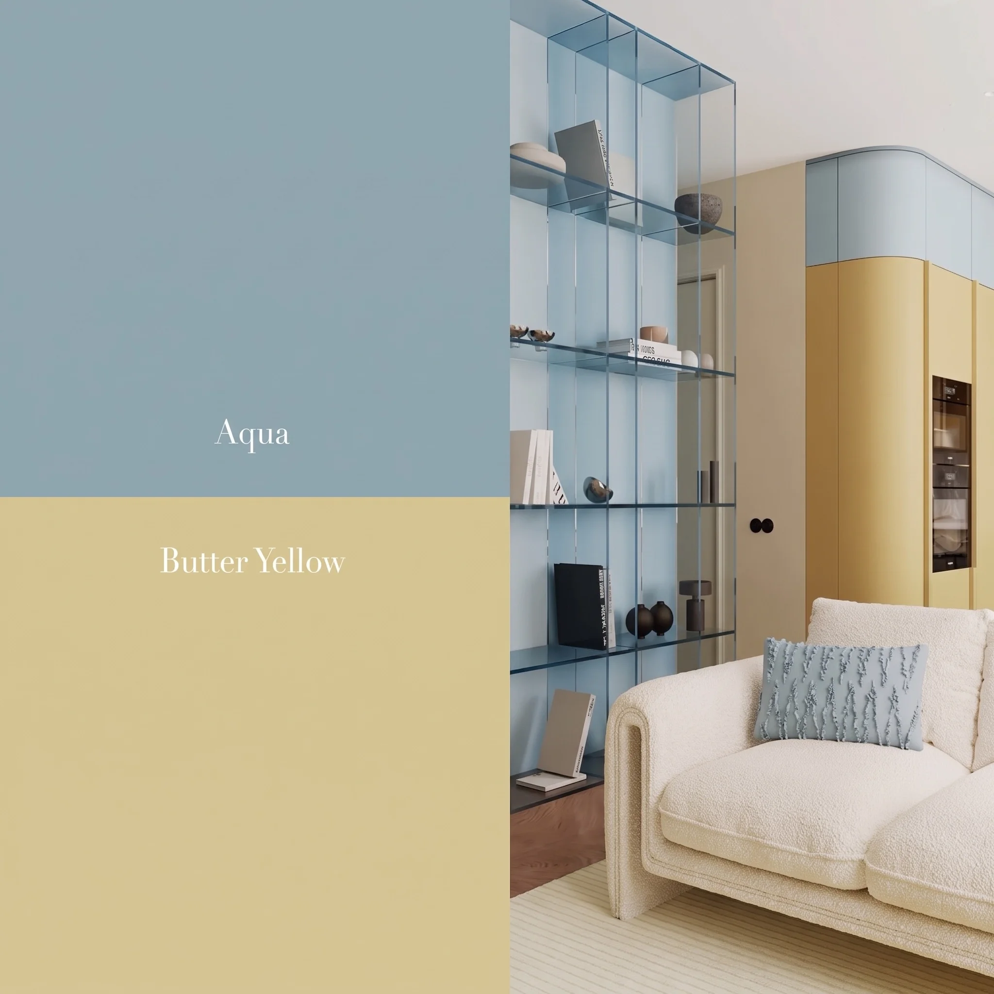
Aqua + Butter Yellow
There’s something incredibly calming about soft aqua tones paired with warm buttery yellows.
The blue brings clarity and softness while the yellow adds warmth and optimism. Together, they create a palette that feels light-filled, relaxed and quietly confident.
In interiors, this combination works beautifully when balanced with natural textures and softer finishes.
Think:
Pale blue joinery
Cream boucle seating
Warm timber flooring
Brushed metals
Soft stone surfaces
The overall feeling is calm but not cold.
Minimal but still welcoming.
There are some colour pairings that immediately make a space feel elevated.
Not because they are loud or trend-driven, but because they create contrast, softness and emotional balance all at once.
Lately, we’ve been drawn to combinations that feel slightly unexpected yet timeless. Colours that bring warmth to minimal spaces or depth to lighter palettes. Pairings that feel both contemporary and nostalgic at the same time.
Two combinations we keep returning to:
Aqua + Butter Yellow
Pale Blue + Burgundy
Both feel fresh, layered and surprisingly versatile.
Read on for how you can incorporate these in your home, wardrobe or anywhere else.
Pale Blue + Burgundy
This combination feels moodier and more dramatic while still remaining refined.
The softness of pale blue creates the perfect contrast against the richness of burgundy. It’s a pairing that feels sophisticated, editorial and slightly European in tone.
What makes it work is the tension between lightness and depth.
The pale blue softens the heaviness of burgundy, while the burgundy grounds the space and adds richness.
It works particularly well through:
Upholstery
Accent seating
Joinery
Artwork
Sculptural furniture pieces
The result feels layered and memorable without overwhelming a room.